Coaching & Consulting for Leadership Transformation, Strategic Thinking, Lifting Team Performance & Business Growth
THE BRIEF / BRAND CREATION
The goal was to align Bowman+Co’s brand with their high-end client base. The outcome, a clean, modern and confident design that balances professionalism with personality. The dots represent collaboration, movement and strength and the colours, fresh, bold and warm paired with white bring clarity and focus. The identity, developed from the logo, fonts and colour palette, was applied across stationery, icons and sub-brands.
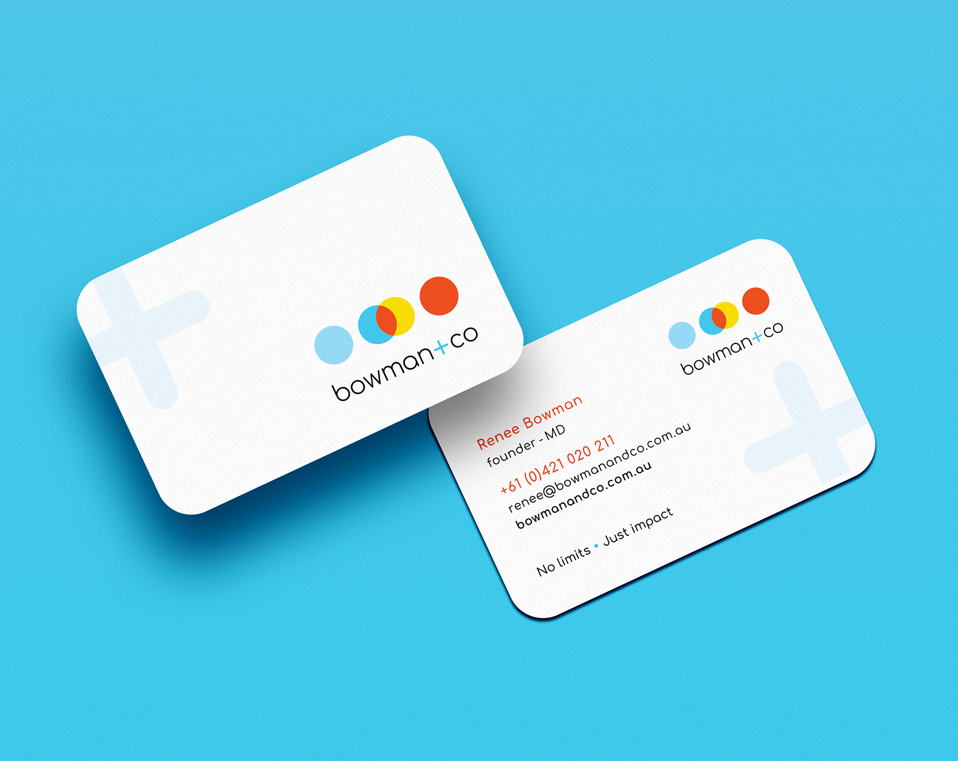
Business Card
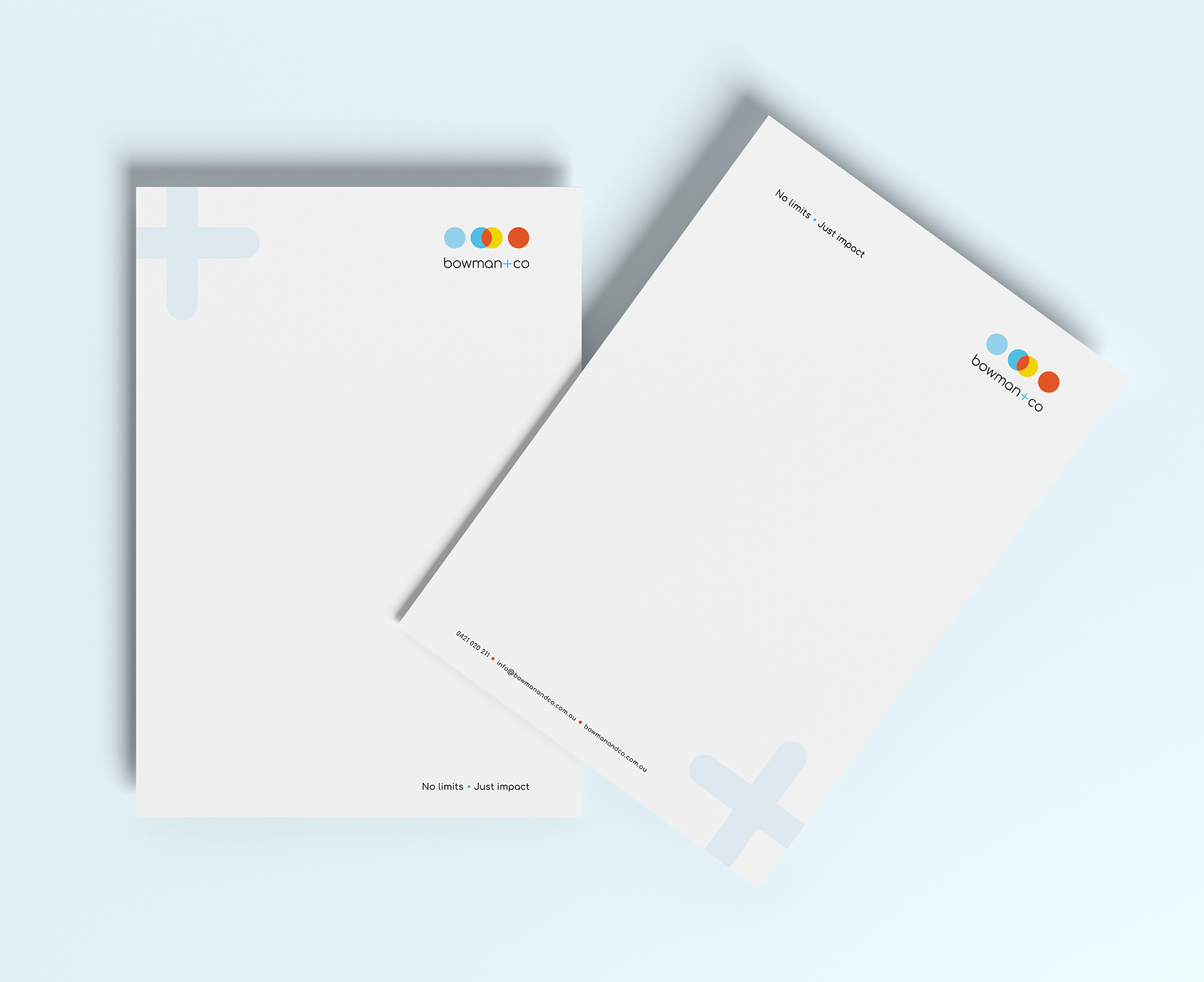
Letterheads
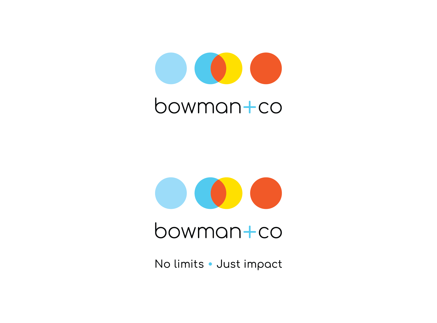
Logo with and without the tagline
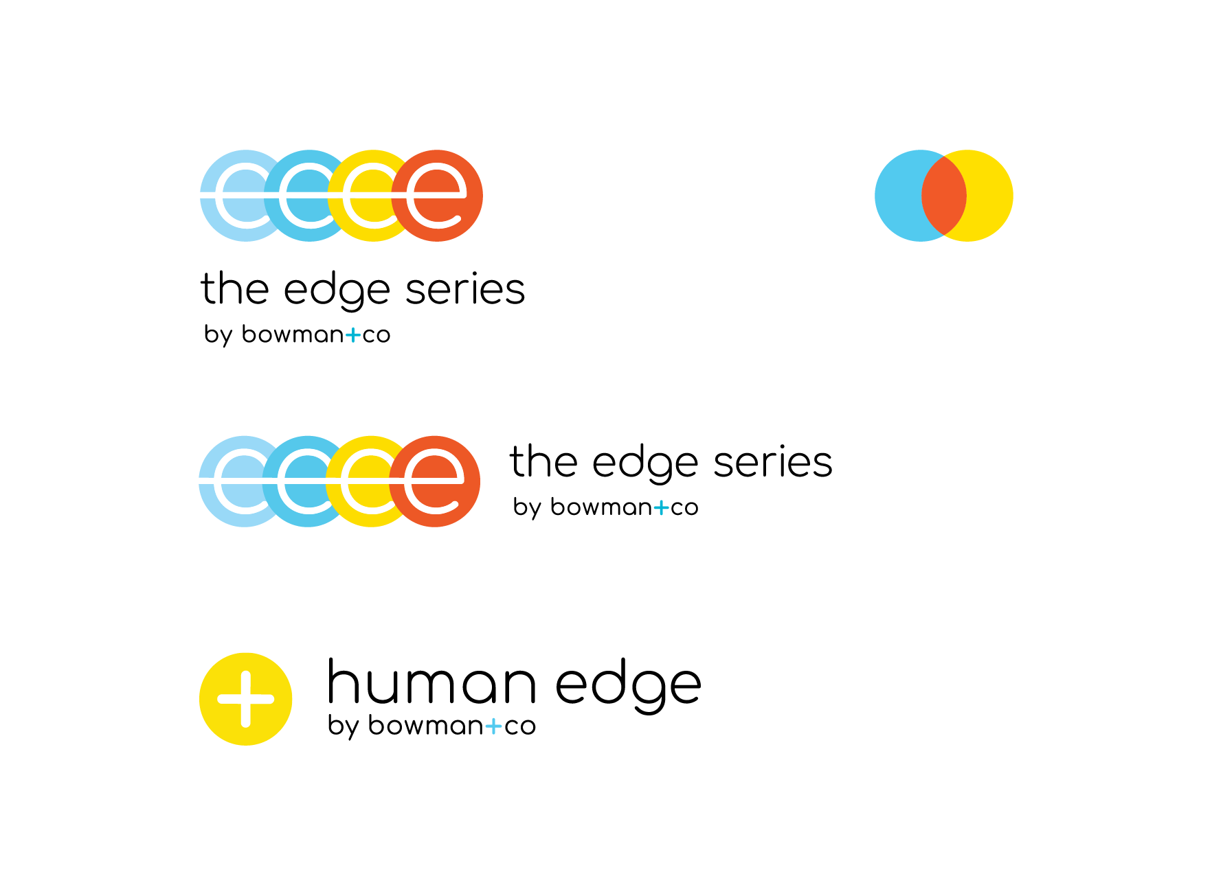
Sub-Brand Logos

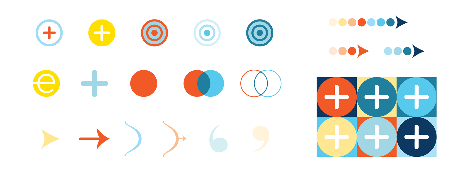
Design Element Collection
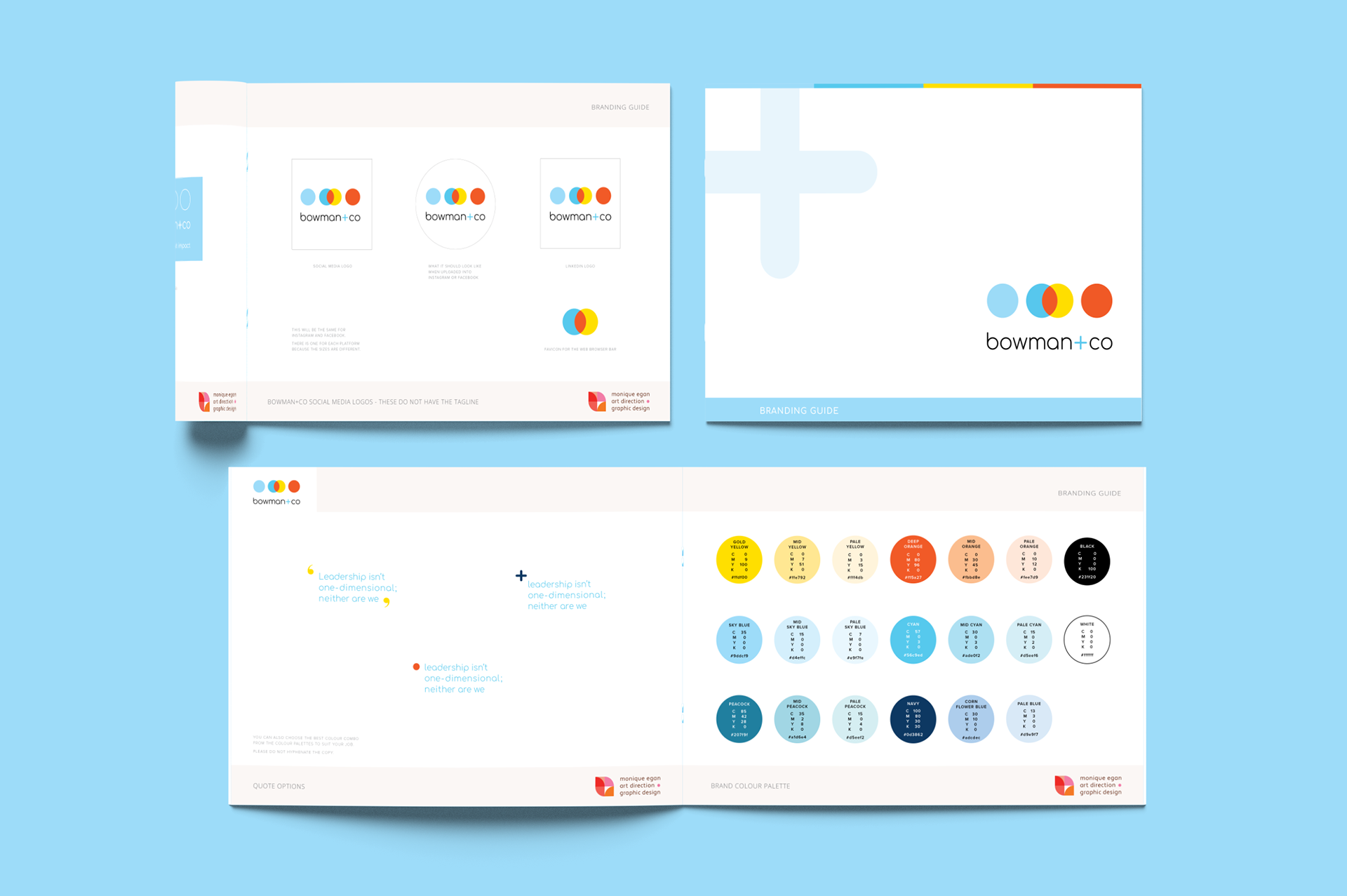
bowman+co Brand Guide